I often do a number of trainings on MSBI and PowerBI and one of the tasks we do during the course is “I would ask all participants to use the raw data and represent any information in the way they see it being used by the CEO of the company”. The participants have complete freedom to select any kind of charting control and do any changes they want to the report. Often once this exercise is done I go to each of them and explain what is great and not so great about their choice. In this post I try to explain some of the common mistakes people make when using charting controls.
Too Much 3D
By far the most common problem with beginners is the over use of 3D visualizations. While I can understand the appeal. Making a chart 3D doesn’t convey any new information and when not implemented properly can often result in distracting the user from the actual numbers. Take the below example. Both pie charts show the same information. Do you find yourself staring at the blue rim at the bottom of the 3D chart? It is much easier to focus on the numbers on the left hand side chart than the right. A clean report not only performs better during loading but also helps people stay focused on the stuff that matters i.e. the actual numbers. I often see that this mistake is made by application developers used to designing websites and windows applications.
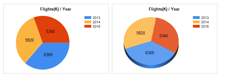
Note that I am not saying using 3D is bad in fact later on I will show an example where 3D becomes critical to the success of the report.
Too much data too little space
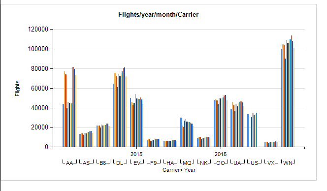
The next most common mistake I see includes trying to put too much data within a single control. This is often visible when using Bar charts. Database developers often make this mistake. They try to show a single chart that answers more than 1 question. While this might be valid in some scenarios often it’s a pain to try and visualize only the subset of data that you’re interested in. PowerBI and visual interactions are a great solution to this problem because a subset of secondary charts can be configured to show only relevant data points based on the interaction with the primary chart. However this is not true for SSRS as a result the user ends up with too much information on the chart and often misses out on the one relevant data point.
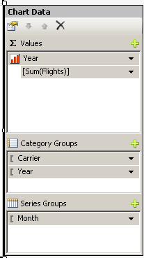
Ideally a chart should answer just one question or at most two. If a chart is trying to display more than 2 dimensions it should probably be a drill through report. Take for example the below chart. Here I have listed the number of flights for the year 2015 by Month for each carrier.
|
|
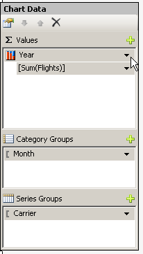
Since I am showing the data only for 2015 it actually makes sense to rewrite the report like below.
|
|
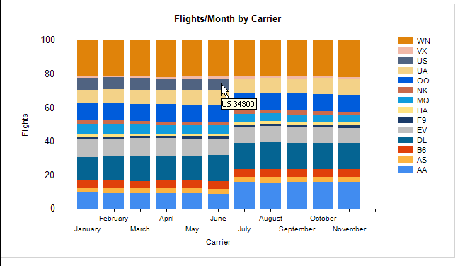
Notice that the above chart has some noticeable difference. First it is a stacked chart secondly the x Axis represents time and the series is the Carrier. The amount of information being displayed is the same however if you notice the chart pointer you will see the US Air ceased operations in June and the number of flights operated by it seem to be taken over by AA as can be seen from the higher percent of flights operated by them in July. Knowing which chart is best suited and how to represent the data best comes with experience but if the developer puts a little thought into the report before designing it these things become clear at the get go.
Not everything needs to be chart
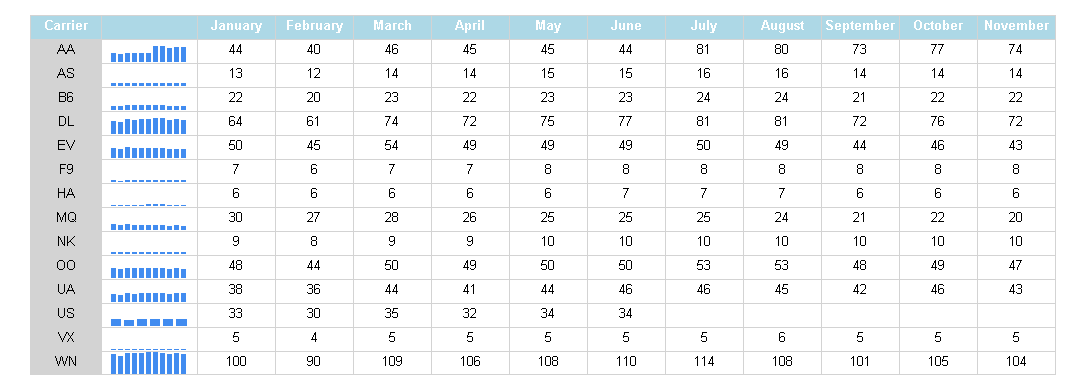
This is another common issue I find with developers. Often when I ask for a report it’s assumed that I am asking for a chart visual. Developers needs to understand that while charts are good. Sometimes it is much easier to represent the data clearly using a standard table or matrix. With the ability to group on rows and columns and add subtotals it provides a lot of flexibility to show “big picture” like grand totals as well as detailed analysis. For example going of the same data set we used earlier I have created a Matrix report which conveys the same information where even the numbers are available for further analysis. Not to mention additional coding can be performed to change the color of the value depending on how number net change has occurred compared to previous month etc. I have added a data bar in order to give a sense of trend here just to point out that tables and Matrix can show trends without needing to resort to a line chart or bar chart.
Using Bar chart where a Line chart should be used
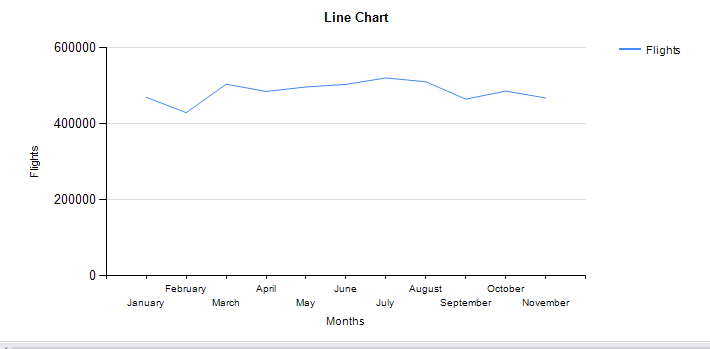
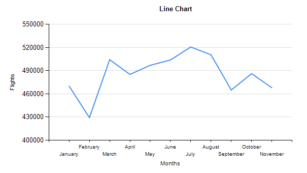
A line a continuous set of points and as such when the data is continuous and implies some sort of continuity it makes sense to plot it on the Line chart for everything else there is the bar chart. For example when I am plotting the number of flights per month it makes sense for me to use a line chart. As shown below
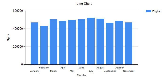
The same could also be represented as a bar graph as shown below. While I can admit the bar graph results in a more filled out graph it doesn’t suitably imply on the continuous nature of the months against which the data is being plotted.
The line graph can be made more “FULL” by changing the axis properties to show a scale that is range bound. This helps not only to fill up the chart but also accentuate the peaks and valleys and shows subtle changes in the data more clearly.
In the next post I cover some of the other charting controls such as pyramid, KPIs as well as new controls available in tools like PowerBI.
Please Consider Subscribing