In this second part of the series on charting controls we take a look at a few lesser known charting controls. You can view the first part of the series by clicking here.
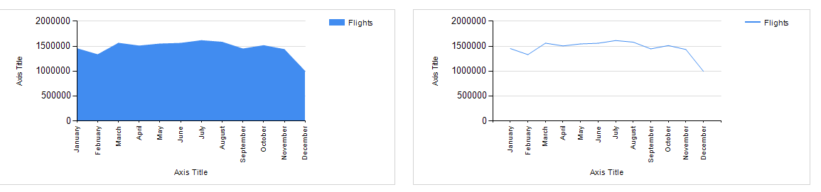
Don’t use Area charts to plot a single metric unless it has to do with Volume.
If there is a single metric that needs to be plotted it can always be plotted against a line graph. The only exception would be if you’re trying to give a sense of volume to the data. Much like population charts or volume of shares traded. Take the below example where I am trying to show the number of flights being flown every month. The line chart doesn’t give a real indication from a volumes perspective. If on the other hand I was trying to plot the ticket price variation on a monthly basis then the line graph makes much more sense.
Using the right series with just the right kind of data
Area charts are best used to show variations in quantity proportionate to other metrics over time. For example we can instantly see that June and July seem to cause a spike in late Aircraft arrival. While at the same time being able to compare the relative sizes of each type of delay against the other. 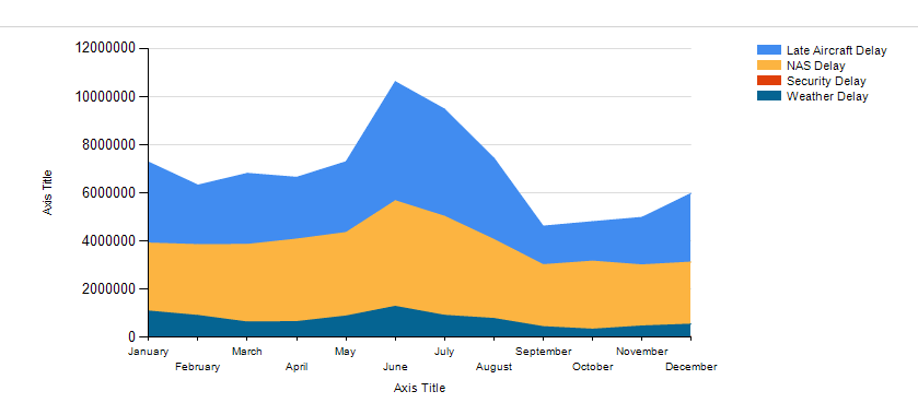
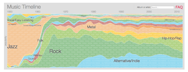
This too can be done in a Line graph but the differences won’t be as obvious. This is a limitation of the data I am using so I have attached a better example of an Area chart below. The below chart plots the different genres popularity over the last 60 years. As you can see there are much more discrete series than the four I have plotted above. But in spite of it we can see the most popular genres at any time simply by visually comparing the areas. The limitation of this chart is it is possible for a few large metrics to completely mitigate any data points for smaller metrics. E.g. in the previous chart there is one more series called Security delay which is so insignificant that it doesn’t even look like it’s part of the area chart. It helps to have values such that the average of each series in the chart has a difference of at least 250% from each other.
Use a time series
As you can see from the above examples Area charts are best suited for time series data. In other words almost always Area charts are used when the x axis represents some measure of time. Which is why it is really good for plotting seasonal changes etc.
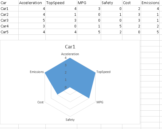
Using Polar charts
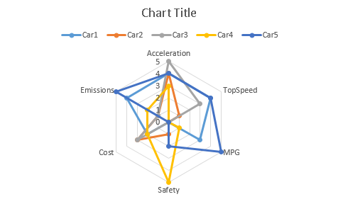
A polar chart or radar chart is a variation of the Area chart where the time series component is removed and replaced with some discrete series groups. Much like how I mentioned in my previous post that a line chart is good for showing flights by month and a bar chart is good for showing flights by carrier. One of the most common places the average person might have seen this chart is to plot performance characteristics of car within a dashboard. Below is an example of a Radar/polar chart showing a performance characteristics of a Car.? Notice how I am plotting only one care here. The nature of this chart is such that plotting more than 2 -3 different cars will result in the chart looking cluttered. The best aspect of this kind of chart is to notice outliers quickly. See how the car score a zero for safety. When used often enough the shapes make inherent sense to the user and the chart becomes super easy to read.
All cares plotted for reference
Please Consider Subscribing