When the trailers for the Aliens movie came out the one thing that caught my attention was how little the look of the alien has changed over time. It is still as menacing and scary as it was when we first saw it. The got me thinking about what is so special about this design of the alien that we still relate to it after all these years. In contrast look at how many times the joker in the batman series has been revamped and you can see that it is actually possible to come up with a design that stay relevant over the years. Now before you say this post as nothing to do with technology let me give you the example of Google home page.
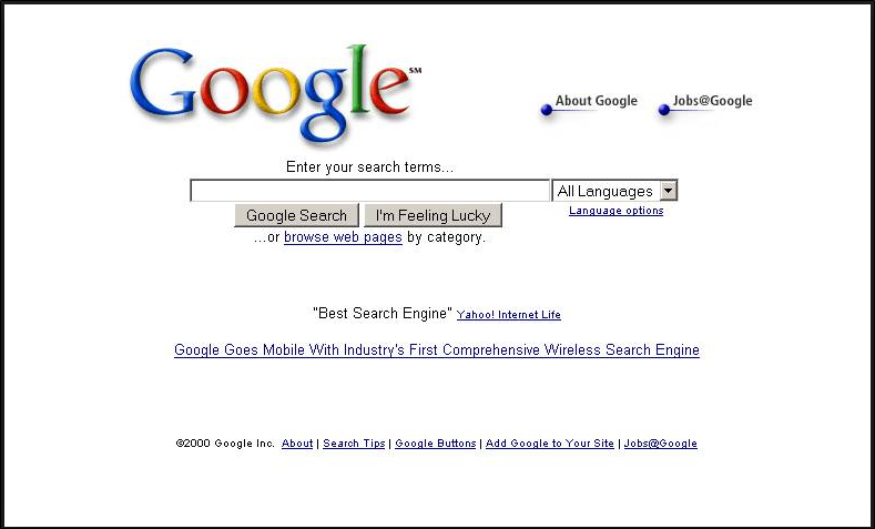
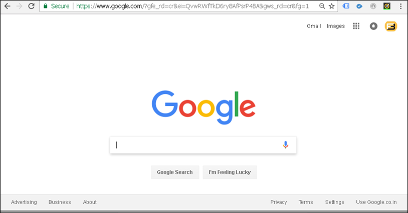
At first glance you will obviously agree that it’s even better now than it was in 2000. If you look closer you will see there are actually fewer controls on the page than when they started out. This minimalist approach has been a main stay of the google home page since day 1.
Now why is this important?
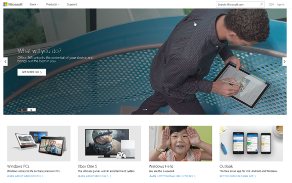
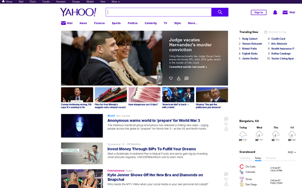
How many times have you gotten to your desk to do one thing and ended up doing something else entirely. We get distracted easily. You might notice this even on your phones. You pick it up to don one thing and end up doing some other task entirely. The reason is too many distractions. It’s very hard to get distracted when you’re on the google home page as say compared to the Microsoft home page or even Yahoo.
|
|
|
So what?
We often visit a website to get information or some work done. Try reading the newspaper when someone is talking to you, and your phone is ringing and your kid is pushing the paper from the other side. That’s what the experience feels like on other websites. Which begs the question do we need all this information now or just the ones that are relevant to what I am trying to achieve. It is more important to allow users to get started than the flood them with information about all the other things that they could potentially do.
So am I saying that everybody should adopt a minimalist design approach?
No. The idea here is to focus on how the functionality of the website improves the user experience. When was the last time any of us read the user manual for a product we bought? Why because designers have found way to make their product work out of the box with minimal know how.
|
|
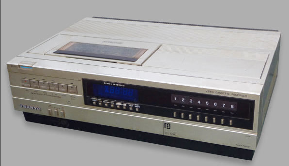
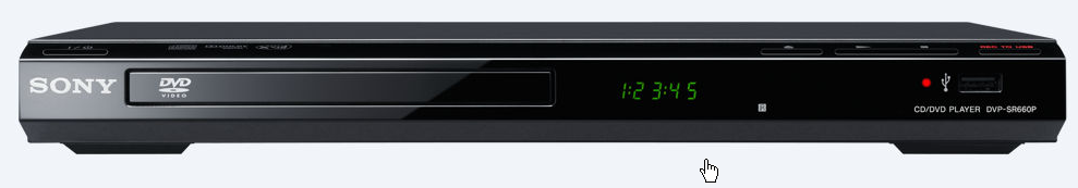
Looks how far we have come from the tens of buttons on the old VCR (which only dad knew how to operate) to the sleek elegance of the DVD player (which basically anybody can use in just a few minutes). The DVD is obviously more complicated as a technology but the design masks the complexity allows users to get started ASAP. Reminds me of the time when I was a student I would decide if I wanted to read a book based on how thick it was.
Anything else?
Take inspiration from the auto industry where there are many iconic designs such as the VW Beatle or Porsche that have stuck with the basic formula for decades and never lost its charm. Probably because the design becomes a part of the products identity not just another aspect of it.
So the next time you design as website ask yourself:-
- Does the home page convey too much information that might not be relevant to the casual browser?
- Why Casual browser cause your regular customers already visited the site and have a handle of where they need to go so won’t spend too much time on the home page anyway. Like how you directly navigate to the login Page on most websites.
- Can I get actual work done directly on the homepage if not how many click before I can
- Is there a way to keep this website fresh without giving it plastic surgery every few months
- Can it be made any simpler?
I often see clients and developers get carried away with making things flashier and try to cram all the latest trends and design into a website to impress the user. The razzle and Dazzle might get me to notice but if I have to use the site regularly I am going to get bored soon. By the way the same goes to Reports too.
Remember the average attention span for your target audience has come down drastically in the last few decades and shoving text or long videos into your home page is a guaranteed way of making sure nobody reads it.
Please Consider Subscribing