War is an ugly topic, but I wanted to know if we have learnt anything from history and so I downloaded the data for all the wars since 1900 till date to get an understanding of how things have changed.
The below chart shows the duration in years on the x axis and the count of wars for this duration. Overall we see that the overwhelming majority of wars are short duration and typically last between 1 to 2 years.

The below graph explains the trend further showing that civil wars tend to drag on longer, often the protracted wars result in victory to the Main party e.g. India in Insurgency in Jammu Kashmir , Sri Lanka against the LTTE and Spain against ETA.

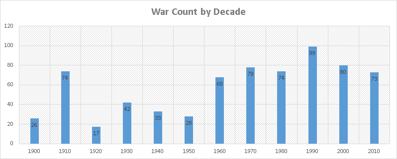
Maybe we could take hope in the fact that short duration wars reduce the impact of these wars on humanity, if it hadn’t been for the below chart which shows the number of wars being fought had increased.
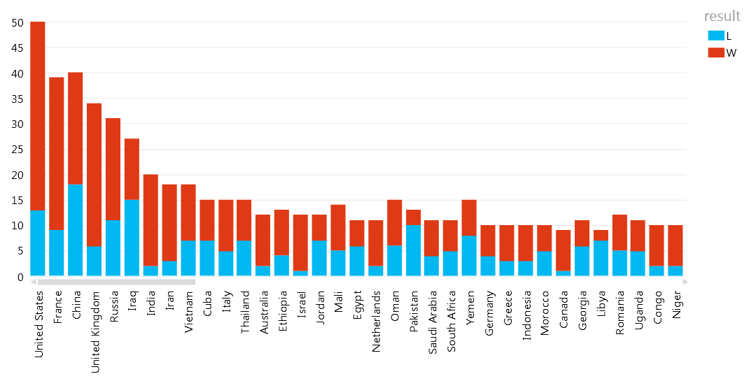
Some of the popular waring nations, the list includes civil wars (orange) and conventional wars. Interesting to note that countries that have the highest tallies usually have both internal and external wars. Keep in mind the list includes countries that have provided covert support for waring nations as well.

In the last 115 years we have never had a single year when the world was at peace. The below chart shows the number of conflicts by year, as you can see, we live in a more violent time today with more countries and war zones.

List of countries with Win Loss Record (this is only a fraction of the total number of countries)
There are more facts to be displayed but by this point I am too depressed to continue. Interesting thing to note about the countries that lost the wars is that they often seem to end up in turmoil even after the war, while the countries that win the wars typically move higher up the economic ladder.
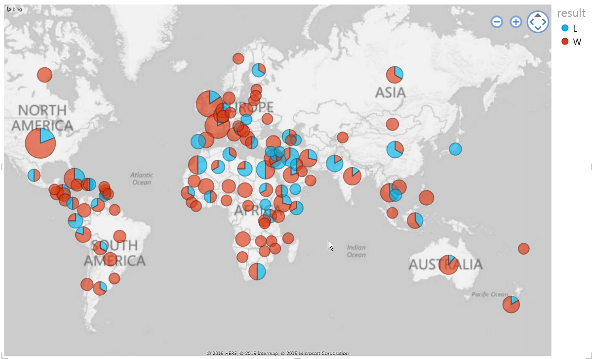
Below is a world map of Conventional wars.
Below is a world map of Civil wars and insurgencies
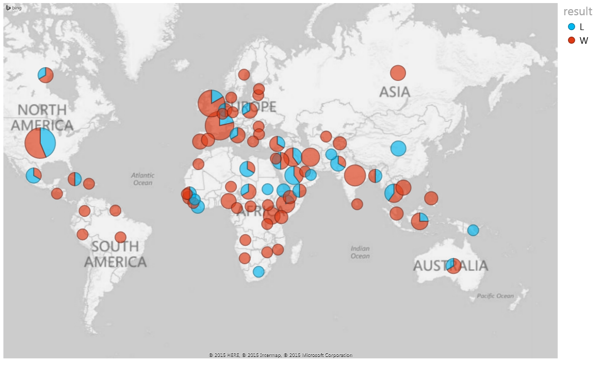
In Summary, the only place war hasn’t happened are the places where people don’t exist. Surprisingly, you will see that Europe, Africa and Regions near the Panama Canal seem to have the largest amount of strife. Europe has obviously settled down after the world wars but not much help for Africa.
The Cold war has obviously raised its share of tensions as well the Middle East Conflicts. Please note the data does contain some issues with mappings of country names mainly due to change in name such as Soviet Union to Russia etc. Almost every country in the United Nations has been at War in the last 100 years and things obviously has gotten better in limiting the scope and damage caused due to war but we are no closer to eliminating it all together.
Geographic Isolation does provide a measure of comfort since countries that have barriers like Oceans and mountains between their neighbors tend to fare better with fewer enemies and more wins during conflicts; example include United States, India and Australia. The United States tends to fare better in all-out war than aiding insurgencies while India seems to be able to tackle domestic unrest more easily. Also if you’re thinking most of the countries have a war against them because of the world wars then think again, almost every country has had a war either before or after the world war too.
So why did I write this post, despite its depressing content? As a database professional I am fortunate in being able to view and work with data in different ways, after analyzing my phone bill (a real eye opener), bank statements (saved me a ton of money), climate change data (got rid of certain misconceptions) and now war data (reinforced my assessment of the world) I look forward to the next enlightening dataset and any surprises it might have for me.
Please Consider Subscribing