A picture is worth a thousand words, a decent chart is probably worth a million. I have been conducting trainings on MS SQL Server Reporting services recently and an important point I can’t over emphasize is the look of the report. Creating the report is fine, anybody can do it, but the true developer is one who understands the business and selects the appropriate visualization method. Here is a chart I think ranks very high in terms of information conveyed.
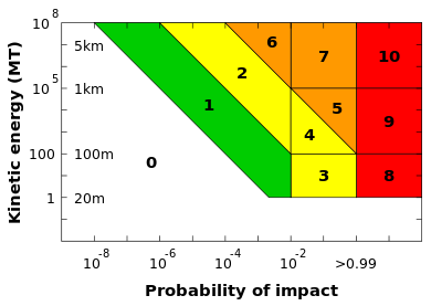
The above graph conveys a ton of information on the probability and possible effect of an asteroid impact on earth the details are available here.
The Scale rates impacts on a scale of 0 – 10 with 10 being the extinction event. The y axis shows the energy released on impact in Mega tons of TNT. It also represents the size the asteroid should be in km diameter to achieve the tonnage. The X-axis represents the probability of impact on a scale of 0 to 1.
For example the scale of 1 shows that any asteroid whose trajectory has been mapped has very low probability of hitting earth and therefore poses no threat regardless of size or tonnage.
On the other hand scale 8 shows that an asteroid with an intersecting trajectory with earth just needs to 100 m across to cause a major catastrophe.
So at one glace you get from the above chart
Asteroid size, Impact Damage, probability of impact, relative damage estimation, Damage grouping.
As a side note I would add one more bit of information on this chart which is the time to impact. We are at a stage where we possibly have the technology to prevent or eliminate any threats to life on earth. If the secondary y axis includes a time scale in 50 year intervals with 0 being on the top and 250 at the bottom we would get the revised scale measuring collisions on reaction time from earth as well. Something like below.
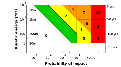
A bubble chart overlay showing the count of objects found in each group would help plan future space programs.
If you have seen some really fancy charts (I am not talking about a pie chart in 3-D) feel free to drop a link, it might help all of us looking to represent our data better.
Please Consider Subscribing